How to elevate a radar plot using R ggplot2 and related extensions.
R
data visualization
ggplot2
Published
August 24, 2022
Overview
After experimenting with a few different radar plot libraries in R, I wanted to see if I could create a custom radar plot with ggplot2. In this tutorial, we’ll cover how to create your own custom ggplot2 radar graph. Before we begin, here’s a list of the packages we’ll be using:
tidyverse
geomtextpath
ggimage
Read & Reshape The Data
Let’s kick off with bringing in the data. For our tutorial, we’ll be working with a Superhero data set I collected from an earlier project.
The data set includes information about power abilities per character (intelligence, combat, strength, etc). Before plotting our data, we need to make sure it’s in the right shape- dplyr to the rescue! For this exercise, we’ll need it in a long format - each record should represent a super power per character.
When we import tidyverse, we automatically import both dplyr and ggplot2.
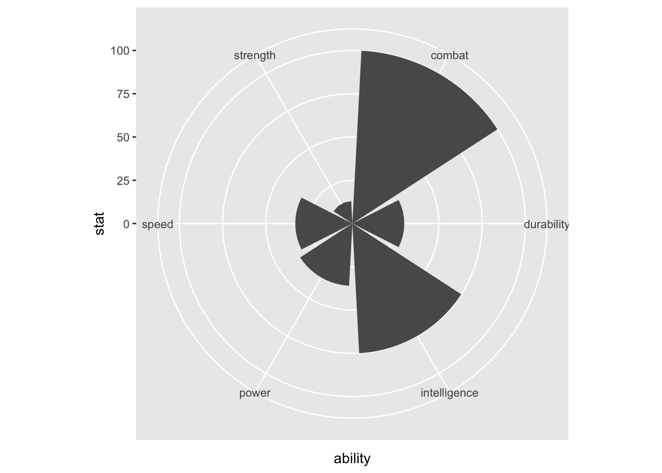
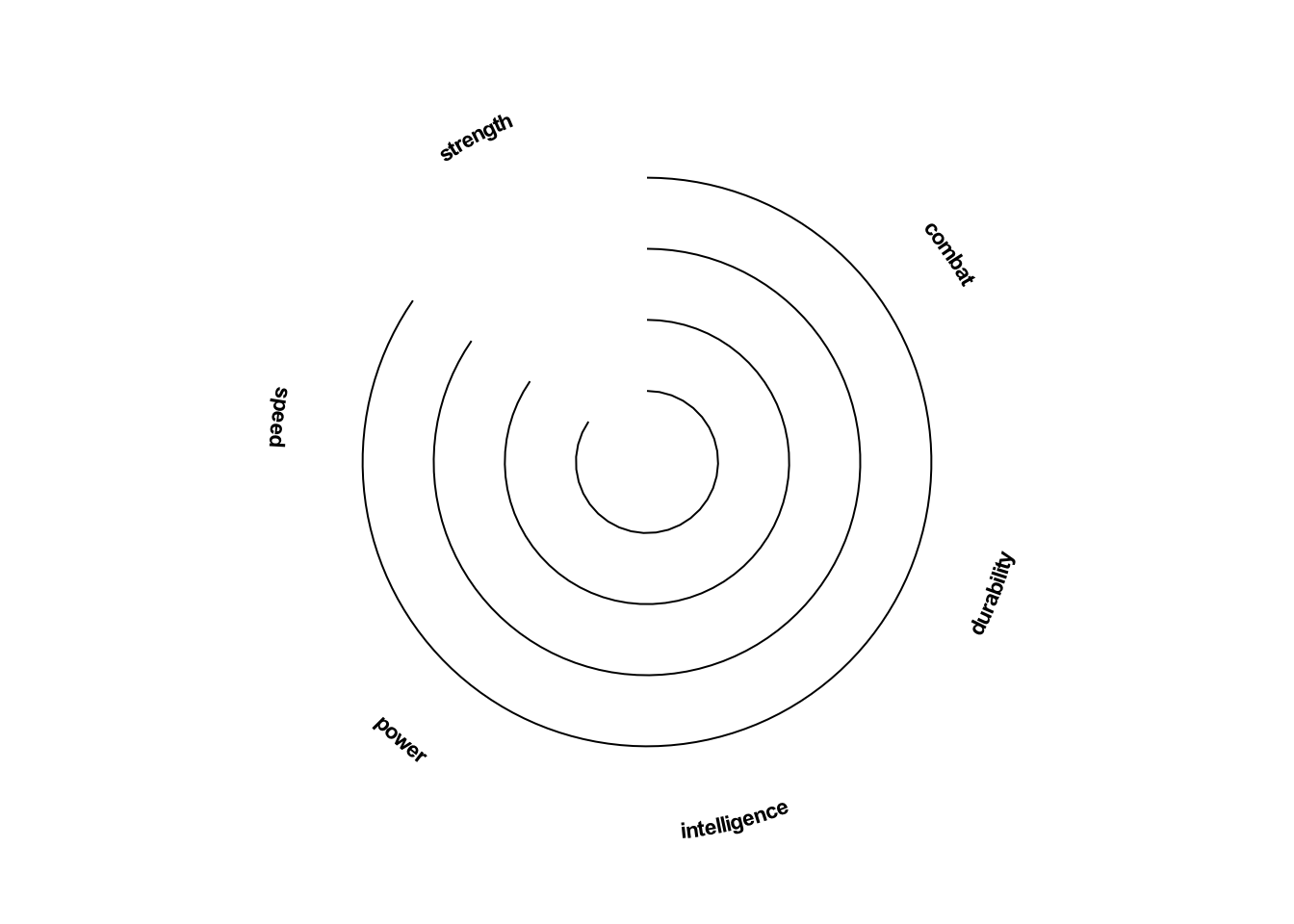
To make this truly custom, we’ll need to work with a blank canvas, using ggplot’s theme_void. From there, we’ll add back the things we need - namely grid lines and axis labels.
We can add our y grid lines them back in with ggplot’s geom_segment.
To create our x axis labels, we will use new ggplot extension package, geomtextpath. This library helps us create curved labels around our radar plot with geom_textpath.
library(geomtextpath)#custom dataframe for line segmentssegments<-data.frame(x1=rep(0,5),x2=rep(5.5,5),y1=c(0,25,50,75,100),y2=c(0,25,50,75,100))plot<-ggplot(black_widow, aes(x=ability, y=stat, fill=ability))+#circular coordinatescoord_polar()+#blank canvastheme_void()+#new x labelsgeom_textpath(inherit.aes=FALSE,mapping=aes(x=ability, label=ability, y=130),fontface="bold", upright=TRUE, text_only=TRUE, size=3)+#new grid lines - leave space to add in our y axis labels latergeom_segment(inherit.aes=FALSE,data = segments,mapping=aes(x=x1,xend=x2,y=y1,yend=y2), linewidth=0.35)plot
Keep Building
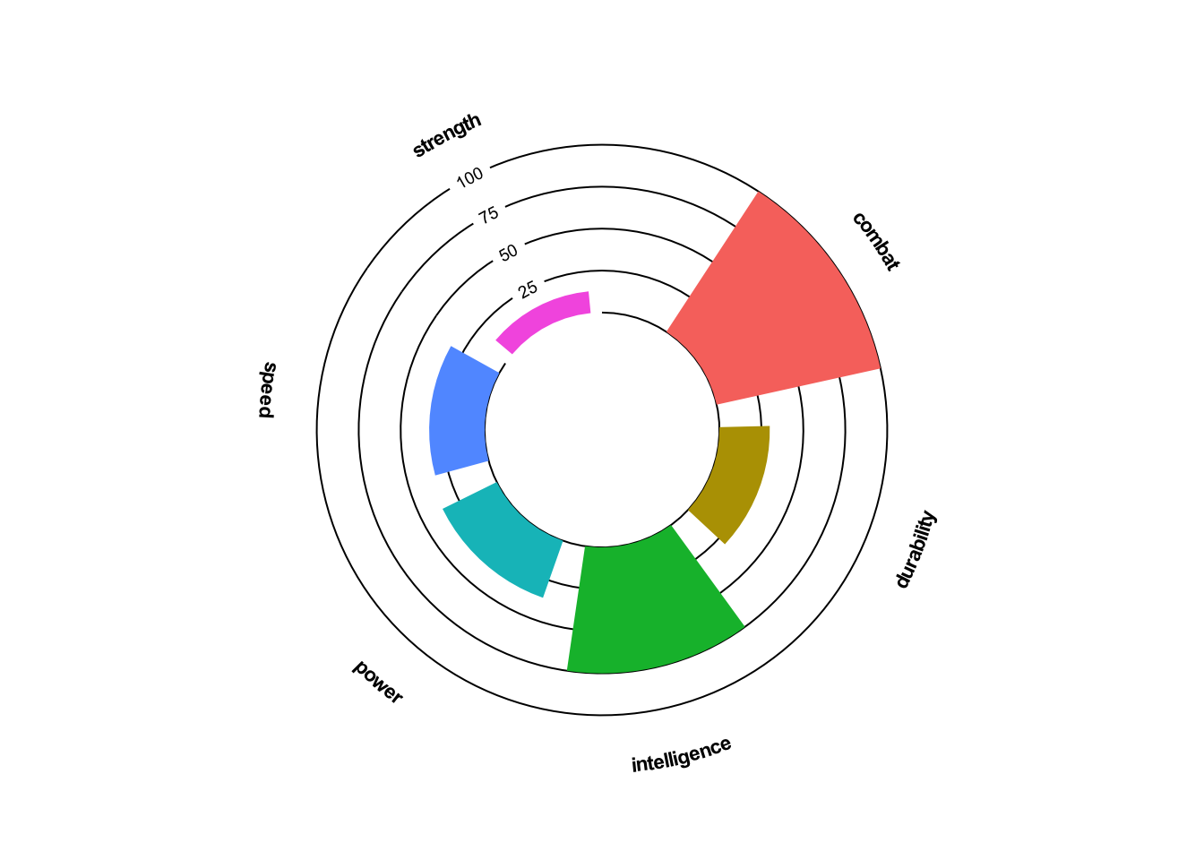
Now that we have our new outline, we’ll overlay our Black Widow data and continue to customize.
Add in the data with ggplot geom_col. We’ve already set the aes mapping in the first step, but we’ll use the width argument to adjust the column size and suppress the legend by setting show.legend to FALSE.
To create the donut hole in the center, we’ll use scale_y_continuous to adjust the lower limit of our y scale. We’ll also add some padding at the top by creating an upper bound limit.
Finally, we’ll add back in our y axis labels using geomtextpath::geom_textsegment.
labels<-data.frame(y =c(25,50,75,100),x =rep(0.25,4))plot<-plot+#overlay datasetgeom_col(width=.8, show.legend =FALSE)+#create donut hole and add some room at the top with limits (our labels are at 130)scale_y_continuous(limits=c(-70,135))+#add the y axis labelsgeom_textsegment(inherit.aes=FALSE,data=labels,mapping=aes(x=5.5, xend=6.5, y= y, yend=y, label=y),linewidth=0.35, size=2.5)plot
Finishing Touches
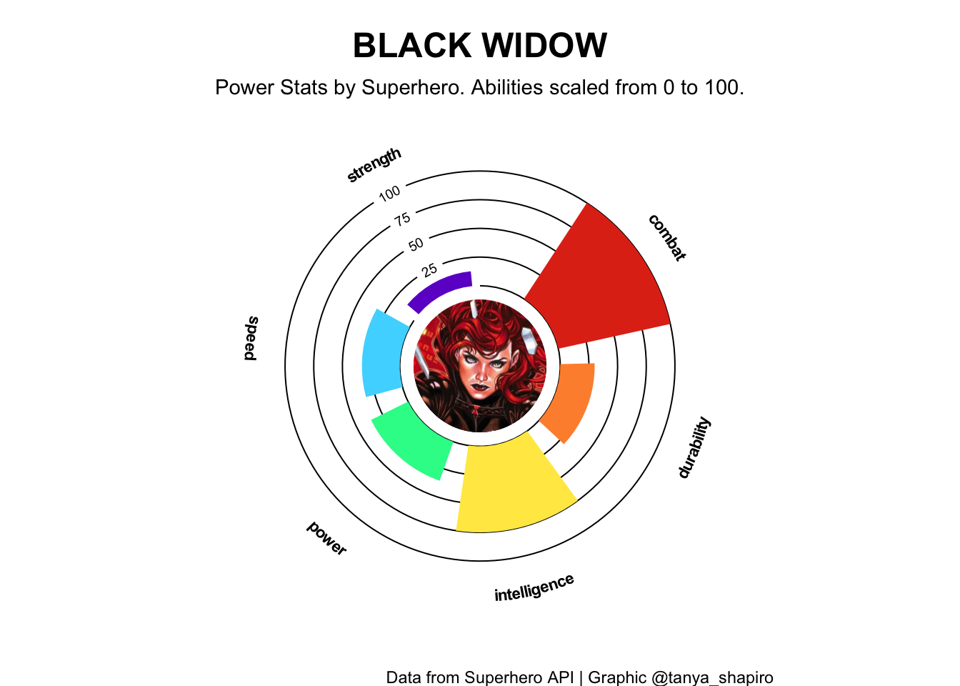
Time for finishing touches! We’ll work with one of my favorite R packages, ggimage. Using geom_image, we can add png or jpeg images directly in our plot. Let’s go ahead and fill our donut hole with a portrait of Black Widow. I have one ready to use from my GitHub!
We’ll spruce up our bar graph color palette with scale_fill_manual. I love playing around with online palette generators like Coolors. You’re welcome to change them with your own hex colors!
Finally, we’ll add our plot titles and labels with ggplot labs and format their look and feel with our own theme. Put it all together, and it should look something like this:
library(ggimage)#link to png fileimage<-'https://raw.githubusercontent.com/tashapiro/superhero-comics/main/images/character-icons/black_widow.png'plot+#add portrain in centergeom_image(mapping=aes(y=-70,x=1), image=image, size=0.225)+#customize bar colorsscale_fill_manual(values=c("#E1341A","#FF903B","#ffe850","#27f897","#4bd8ff" ,"#6F02CE"))+#add plot titles and labelslabs(title="BLACK WIDOW",subtitle="Power Stats by Superhero. Abilities scaled from 0 to 100.",caption ="Data from Superhero API | Graphic @tanya_shapiro")+#make some tweaks to plot themetheme(plot.title=element_text(face="bold", hjust=0.5, size=18, vjust=-2),plot.subtitle=element_text(hjust=0.5, vjust=-5), )
Next Level Stuff
Below is the code for the final Avengers Radar plot I created. Uses all of our ggplot2 tricks and applies them to select characters with ggplot’s facet_wrap!
You can check out more Superhero radar plots on my GitHub. If you have any questions, feel free to reach out to me on Twitter @tanya_shapiro. Thank you!
Code
#add image links to datasetdf_avengers<-df_avengers%>%mutate(image =paste0('https://raw.githubusercontent.com/tashapiro/superhero-comics/main/images/character-icons/',tolower(str_replace(name, " ","_")),".png"))#set color aesthetics as variables#palettespal_font<-"white"pal_bg <-"#131314"pal_line <-"#D0D0D0"pal<-c("#E1341A","#FF903B","#ffe850","#27f897","#4bd8ff","#6F02CE")ggplot(df_avengers, aes(x=ability, y=stat, fill=ability))+#create y axis textgeom_textpath(inherit.aes=FALSE,mapping=aes(x=ability, label=ability, y=130),fontface="bold", upright=TRUE, text_only=TRUE, linewidth=3, color=pal_font )+#image with cahracter icon in the centergeom_image(mapping=aes(y=-70,x=1,image=image), size=0.225)+#text for actual name below superhero namegeom_text(inherit.aes=FALSE,mapping=aes(label=full_name, x=1, y=-70),vjust=-13.6, color="white", size=3.25)+#create curved coordinate system, curvedpolar accomodates textcoord_curvedpolar()+#create linesegments to represent panel gridlinesgeom_segment(inherit.aes=FALSE,data = segments,mapping=aes(x=x1,xend=x2,y=y1,yend=y2),linewidth=0.45, color=pal_line)+#barsgeom_col(show.legend =FALSE, width=.8)+#text for panel gridlinesgeom_textsegment(inherit.aes=FALSE,data=labels,mapping=aes(x=5.5, xend=6.5, y= y, yend=y, label=y),color = pal_line, textcolour= pal_font, linewidth=0.45, size=2.5)+#adjist scales for fill (custom palette) & create y scale limits (create blank circle at center to store image)scale_fill_manual(values=pal)+scale_y_continuous(limits=c(-70,135))+#iterate per characterfacet_wrap(~toupper(name))+#add labels & themelabs(title="THE AVENGERS",subtitle="Power Stats by Superhero. Abilities scaled from 0 to 100.",caption="Data from Superhero API | Graphic @tanya_shapiro")+theme_minimal()+theme(text=element_text(color=pal_font),plot.background =element_rect(fill=pal_bg),plot.title=element_text(face="bold", hjust=0.5, size=18, margin=margin(t=5)),plot.subtitle=element_text(hjust=0.5, margin=margin(t=5, b=20)),plot.caption =element_text(margin=margin(t=15)),axis.title=element_blank(),panel.grid =element_blank(),plot.margin=margin(t=10,b=5,l=10,r=10),axis.text=element_blank(),axis.ticks =element_blank(),strip.text=element_text(face="bold", color=pal_font, size=12, vjust=-0.5))